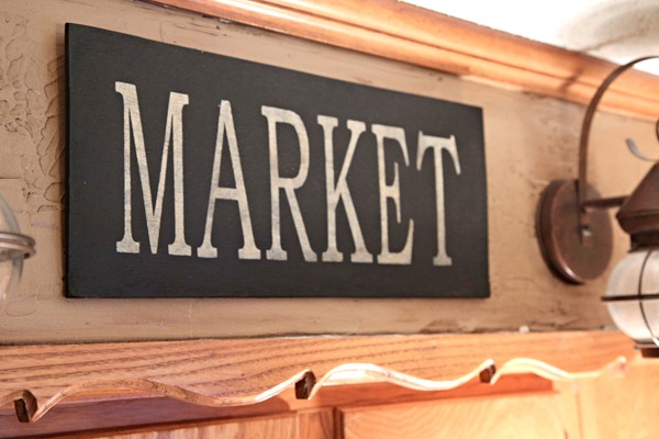
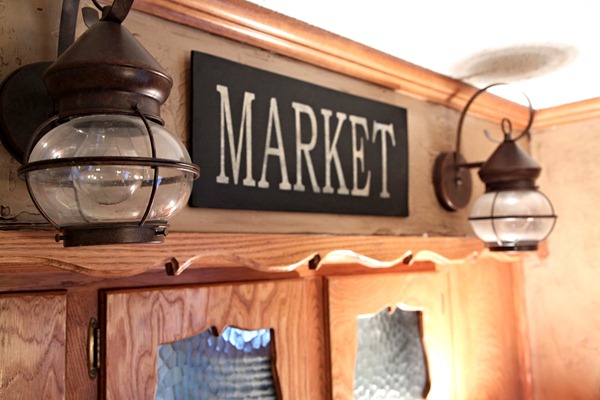
Several months ago I made my first sign. I took a scrap piece of wood and painted “Market” on it. It worked, but the board color blended too much with my walls and the sign was a little on the dinky side.
My husband cut a piece of plywood for me and I made another stencil with my Cricut.
I wanted bold black with off white letters that got a touch of glaze for aging.
Here’s the old one for comparison and the post is here if you want to read it and see how I make them.
Back to the bigger better one.
I have been asked about my lights before. They are porch lights from Lowe’s.
Bigger is better don’t ya think?
Tracy
Linking to
Show and Tell @ My Romantic Home
Frugalicious Friday @ Finding Fabulous
VIP Party @ Designer Garden
Saturday Night Special @ Funky Junk Interiors


